Here’s the configuration settings that I want to show for Vim:
let skip_defaults_vim = 1
set mouse=
Notice the let and set keywords. Let me demonstrate using Firefox:
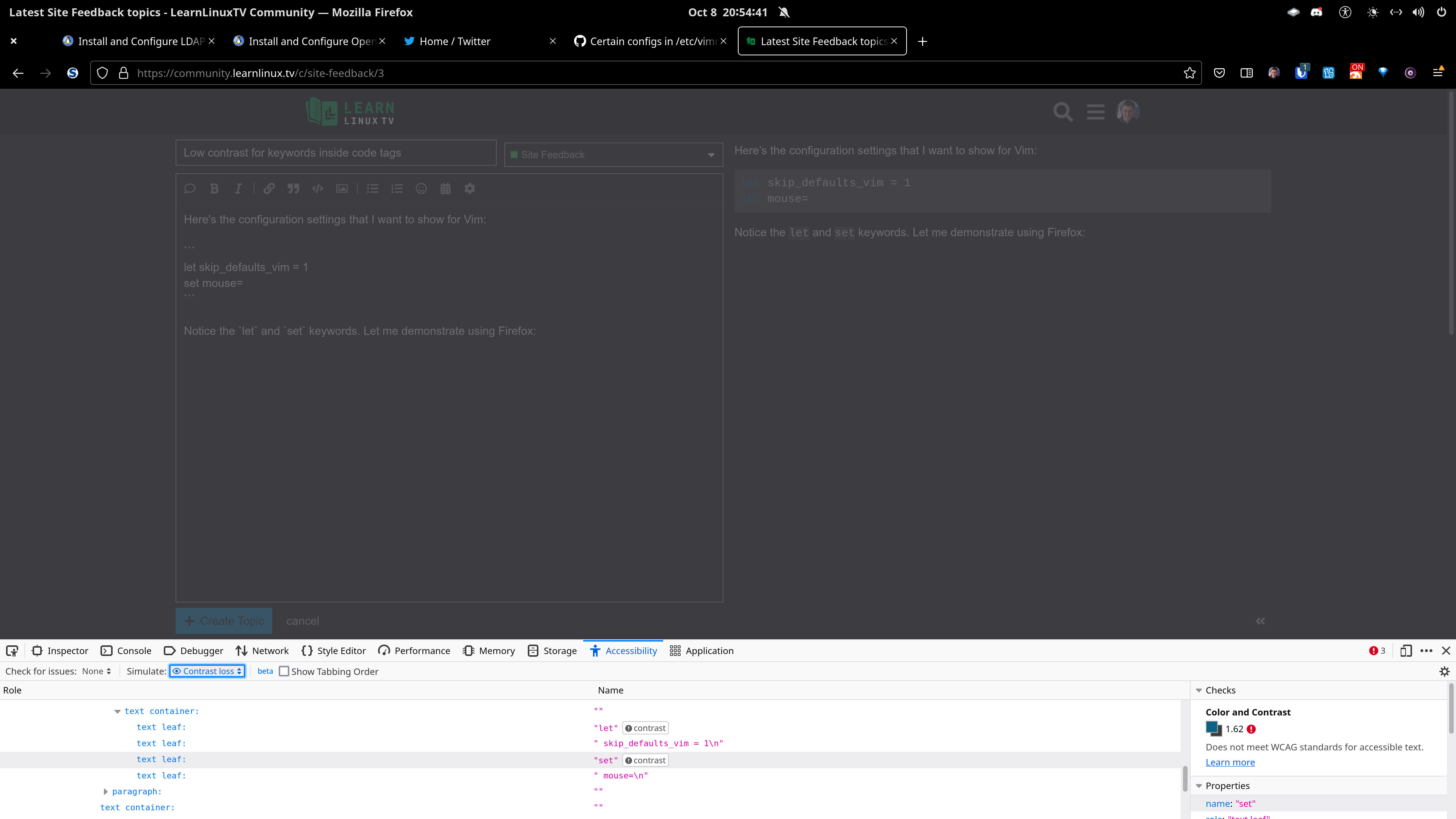
Can the contrast ratio for the keywords be improved so that it can meet AA standard? AAA standard is great, but maybe not a must-have. The background color of the code (in the preview side) can be darkened significantly. Sure, the let/set text color can be brightened; however, darkening the shade of gray for the code in the preview and especially in a thread can significantly increase the contrast ratio.
The higher the contrast ratio for text, the easier it is for anyone with loss of contrast to read text.
As a web developer, accessibility is a top priority for me; not just for those with screen readers, but for those with different kinds of vision losses such as colorblindness and those who cannot see either red, green, or blue colors. The colorblind test is very useful for everyone to use. Please use the accessibility tools found in Firefox’s developer tools if you can.